Essay #4: Living With AI in Healthcare series
Essay three ended with a promise: this piece moves from the moment of diagnosis to what happens after a patient walks out of the scanner room — how AI is starting to watch, quietly, for what happens next.
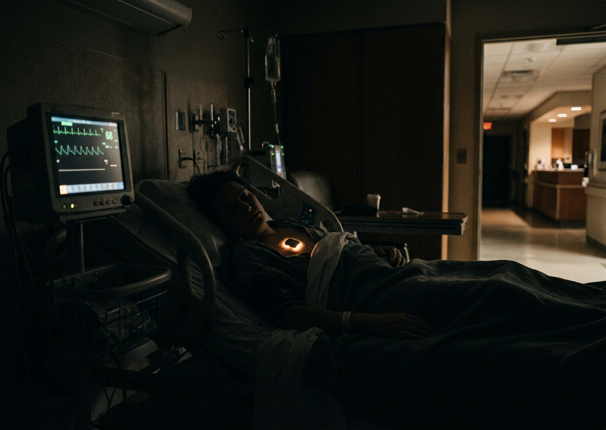
You are lying in a hospital bed. A nurse checks your blood pressure, pulse and oxygen at midnight. Everything looks fine. She’ll be back at four. What happens if something starts going wrong at 1:15?
For most of hospital history, that gap has simply been accepted as how nursing works. Intensive care units solved it decades ago with continuous telemetry — wires running to every bed. General medical and surgical floors never got the same treatment, because wiring every bed on every floor was never practical. That gap is where continuous monitoring is now spreading.
Watching Without Wires
The hardware making this possible is small enough to forget it’s there. A coin-sized adhesive patch worn on the chest can track breathing, heart rate, temperature, and movement continuously. Houston Methodist, which has deployed one such patch at scale, puts the contrast in the plainest possible terms: a nurse manually checking vitals four to six times a day, versus the patch quietly capturing as many as 1,440 measurements over that same day. In a study of patients later transferred to intensive care, continuous monitoring was associated with earlier detection of trouble and a real reduction in mortality risk.
A similar system has the longest track record of anything like it: a ten-year evaluation at Dartmouth-Hitchcock Medical Center found half as many unplanned ICU transfers, far fewer emergency rescue calls, and not one preventable death from opioid-related breathing problems across the entire decade.
Taking the Hospital Home
The same small sensors are now extending monitoring past the hospital’s walls entirely. In a growing number of programs, patients who once would have needed a hospital bed are instead cared for at home, wearing the same kind of sensor, with a hospital team watching remotely. Recent results are encouraging: less overall time spent as a hospital patient, fewer people readmitted within a month, and lower mortality in the following three months, alongside real cost savings. These are strong associations rather than proof from a randomized trial — people chosen for a hospital-at-home program aren’t a random slice of every patient — but the pattern, across a large real-world group, is hard to dismiss.
Already on the Wrist
None of this stays confined to people who are already sick. A growing number of people are already wearing an early, everyday version of the same idea, without giving it much thought — a watch quietly tracking heart rhythm in the background. The largest test of what that’s actually worth involved more than 400,000 people in a Stanford-run study: barely half a percent ever received a notification about a possible irregular heartbeat, but when they did, it was right most of the time — roughly 84% of the time, checked against a proper heart monitor. Screening an entire population this way genuinely works. What it doesn’t settle is what happens to the healthcare system once each of those notifications leads somewhere — a call to a doctor, a test, a worry that may or may not turn out to matter.
Too Much to Listen To
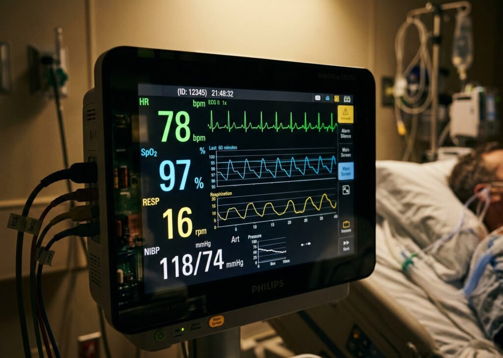
All of this together produces one enormous, converging problem: more information than any human being could ever personally sit and watch. The predictable result is alarm fatigue. Somewhere between 72% and 99% of hospital alarms turn out not to need any action at all — and in a busy ICU, that adds up to something like 350 alarms per patient bed, every single day. A nurse who’s been startled by the same false alarm forty times learns, understandably, to tune it out. Which is exactly how a real one eventually gets missed.
The fix that actually seems to be working isn’t a louder or smarter alarm. It’s a layer of trained human judgment standing between the algorithm and the bedside. One large early-warning program, in place across 21 Northern California hospitals, doesn’t send its risk alerts straight to a floor nurse’s phone. It routes them first to a dedicated team of specially trained nurses, who review the full picture and decide whether the signal is real before anyone on the floor is even contacted. The results have been strong: an estimated 16% lower risk of death among alerted patients, translating to roughly 520 lives saved a year, along with fewer ICU transfers and shorter hospital stays. That single design choice — a trained person checking the machine’s judgment before it ever reaches the bedside — may be doing as much of the real work as the algorithm itself.
Worth knowing plainly: not every tool that carries an AI label deserves equal trust. In one of the largest head-to-head comparisons done so far, a free, publicly available scoring system that anyone can inspect actually outperformed a well-known proprietary hospital software tool built specifically for this job. A brand name and the words “AI-powered” on the box don’t automatically mean better. The specifics of that comparison — which tools, which numbers, and how the company involved responded — are covered below for anyone who wants them.
In Plain Terms
The problem continuous monitoring set out to solve was never really about collecting more data — sensors this small and this cheap were always going to arrive eventually. The problem was deciding what, out of an overwhelming and continuous stream, actually deserves a human being’s attention. Some tools do that well. Some, despite the AI label, don’t do it any better than a free scoring system built two decades ago. The pattern running through every real success in this essay isn’t the sensor. It’s the trained human layer built around it, deciding which alerts are real.
The next essay in this series steps back from any single tool to ask a harder question: as AI moves closer to actual clinical decisions, who’s responsible when it gets one wrong, and where does human judgment have to stay in charge no matter how good the technology gets.
For Those Who Want to Look Under the Hood
The early-warning program above is Kaiser Permanente’s Advance Alert Monitor, evaluated across those 21 Northern California hospitals in a study published in the New England Journal of Medicine. The algorithm scans a patient’s EHR hourly, weighing lab trends, vital-sign trajectories, and existing conditions to flag deterioration risk up to 12 hours in advance. The primary paper reports both an adjusted 16% relative reduction in 30-day mortality (adjusted relative risk 0.84) and an absolute difference of 3.8 percentage points — the same finding, reported two ways in the same table. The unadjusted numbers: 15.8% mortality in the intervention group versus 20.4% in the comparison group, alongside lower ICU admission (17.7% vs. 20.9%) and a shorter stay among survivors (6.5 vs. 7.2 days).
The tool that underperformed a free scoring system is Epic’s Deterioration Index, built into EHR software used in hundreds of U.S. hospitals. A Yale New Haven Health study comparing six early-warning scores across more than 362,000 patient encounters found the open, non-AI NEWS2 score essentially tied for second place (AUROC 0.831), while Epic’s proprietary tool finished among the worst (AUROC 0.808), with a median lead time of just one hour before an event, compared to 11 hours for the best performer, an open academic model called eCART, and 8 hours for NEWS2. At matched thresholds, eCART would have caught more than 300 additional deteriorating patients while generating roughly 48,000 fewer false alerts than Epic’s tool over the same population.
Epic’s public response wasn’t a fix — it was a defense of the status quo, telling reporters the system is intentionally open so hospitals can choose whichever model performs best for their own population, and pointing to one site crediting the tool with a real drop in ICU-transfer mortality. That may well be true there. But a broader meta-analysis of externally validated Epic prediction tools, published this past spring, found the same hospital-to-hospital variability across multiple Epic models, not just this one. Whether Epic is quietly refining the model without publishing about it, treating the criticism as unwarranted, or something in between isn’t visible from outside — the company hasn’t said, and independent researchers can only see the output, not the process. What isn’t standing still is the competition: eCART, developed and published openly by academic researchers rather than a vendor, keeps outperforming it in head-to-head studies, and some hospitals have already switched.
A separate ICU-focused tool, CLEWICU, is a useful reminder of how these approvals actually work. It received FDA clearance in January 2021 to predict hemodynamic instability; a 2024 clearance expanded its use into other hospital critical-care areas. Its ability to flag impending respiratory failure, though, was authorized separately, under a COVID-era emergency use authorization rather than the same ordinary regulatory pathway — different tools, different clearances, different levels of scrutiny, sold under one product name.
The Hospital-at-Home figures come from a large, real-world propensity-matched study published in Frontiers in Digital Health in April 2026, covering 2,905 episodes: a 3.13-day reduction in bed-days, a 30-day readmission odds ratio of 0.55, a 90-day mortality odds ratio of 0.43, and meaningful cost savings.
The wearable-screening figures come from the Apple Heart Study: 419,297 participants, 0.52% notified, an 84% positive predictive value against a simultaneous ECG patch. One nuance worth keeping in view: only 34% of notified participants who returned a usable patch actually had AF detected in that follow-up window — which doesn’t mean the rest were false alarms so much as AF, by nature, comes and goes and may simply not have occurred while the patch was worn. Apple, Samsung, and Google hold FDA clearance for specific ECG and irregular-rhythm software running on their watches — the software function is cleared, not the whole watch as a general medical device. Patient-generated data can flow into systems like Epic MyChart through FHIR connections, and some integrations already work in practice, but how much of that happens varies enormously by health system and data type.
The BioButton mortality-risk figure comes from a Houston Methodist study of 1,120 high-risk patients, showing a 27% relative reduction in mortality risk; a separately cited, larger claim involving nearly 12,000 patients could not be independently verified and was left out entirely. The Masimo/Dartmouth-Hitchcock evaluation, published in Anesthesia & Analgesia and the Journal of Patient Safety, covered an expansion to roughly 200 med-surg beds, with a 50% reduction in unplanned ICU transfers and a 60% reduction in rapid-response events.
State of Play, as of August 2026
The Kaiser Advance Alert Monitor figures come from the original New England Journal of Medicine study. The Yale New Haven Health early-warning comparison was published in JAMA Network Open on October 15, 2024. The meta-analysis of externally validated Epic clinical decision-support tools was published in the Journal of General Internal Medicine in spring 2026. CLEWICU’s FDA regulatory history is drawn directly from FDA database records. The Hospital-at-Home study was published in Frontiers in Digital Health on April 8, 2026, and is observational rather than randomized. The Apple Heart Study was published in the New England Journal of Medicine in November 2019.